Each December, Pantone announces its Color of the Year — a single shade meant to capture the cultural mood and point designers, architects, and homeowners toward what comes next. For 2026, Pantone made history: after years of warm, earthy tones, the choice is Cloud Dancer (PANTONE 11-4201), a serene, billowy white. It is the first white Pantone has ever selected in the program’s 27-year history.
If you are planning a remodel, building a new home, or simply thinking about refreshing a room or two, Cloud Dancer gives you a compelling design direction to consider. Below, we break down what this color is, why it matters, and how to use it well — including some thoughts on how it translates specifically to homes here in Northern Colorado.
Meet Pantone’s 2026 Color of the Year: Cloud Dancer (PANTONE 11-4201)
Cloud Dancer is not a stark, clinical white. Pantone describes it as “a billowy, balanced white imbued with a feeling of serenity.” That language is deliberate. This is a white with softness in it — warm enough to feel livable, light enough to feel open. Depending on your light source and surrounding palette, it can read as a creamy off-white in the morning and a cooler, cleaner tone in the afternoon.
Leatrice Eiseman, executive director of the Pantone Color Institute, framed the selection as “a calming influence in a frenetic society, rediscovering the value of measured consideration and quiet reflection.” Pantone positioned Cloud Dancer around themes of simplification, mindfulness, introspection, and fresh starts — a collective exhale expressed through color.
The historical dimension is worth noting if you follow the Color of the Year program. Pantone has been making this annual selection since 1999. In all that time, no white had ever been chosen. Cloud Dancer breaks that pattern, and does so decisively.
Why Cloud Dancer Signals a Design Pivot
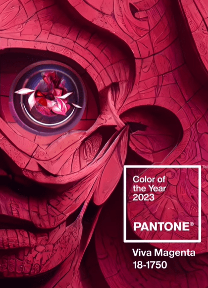
To understand why Cloud Dancer feels like such a shift, it helps to look at the three years that preceded it. In 2023, Pantone chose Viva Magenta — a bold, carmine red with roots in natural dye and a personality built around courage and energy. In 2024, Peach Fuzz brought warmth and softness, a peachy blush with a nurturing quality. Then in 2025, Mocha Mousse leaned into earthy, cocoa-brown comfort — grounded, tactile, and deeply warm.
Three years of warm, pigment-rich colors. Then: white.
For designers and homeowners alike, that pivot is meaningful. If the previous palette was about immersion and richness, Cloud Dancer is about release. Spaces designed around this color tend to feel edited rather than accumulated — light rather than layered. That does not mean cold or minimal. It means intentional. And it opens up a wide range of possibilities for how you layer warmth back in through materials, textiles, and complementary tones.
How to Use Cloud Dancer in Your Home Interior
Cloud Dancer is one of the most versatile Color of the Year picks in recent memory, precisely because white works across nearly every application. Here is how to think about it room by room and surface by surface.
Walls and Ceilings
A Cloud Dancer wall treatment reads differently depending on how you apply it. Painting walls, ceiling, and trim in the same soft white creates a seamless, enveloping quality that makes a room feel larger and quieter at the same time. If you want more contrast, use Cloud Dancer on the ceiling only, keeping walls in a warmer or deeper tone. The ceiling lifts without competing with the rest of the palette.
Trim and Millwork
One of the most effective ways to introduce Cloud Dancer without committing to an all-white room is through trim. Baseboards, casing, crown molding, built-in shelving, and wainscoting painted in this shade create a clean architectural layer that reads as classic rather than trendy. If your walls are a warm greige, sage, or dusty terracotta — colors that connected well to the 2024 and 2025 palettes — Cloud Dancer trim ties them together beautifully.
Furniture
White upholstery has a reputation for being impractical, and in busy households that reputation is sometimes earned. But Cloud Dancer as a furniture tone — in tight-woven performance linen, washable slipcovers, or painted and lacquered casework — is more livable than it looks. A slipcovered sofa in a warm white linen, a lacquered credenza, or a painted dining chair can anchor a room without dominating it. Pair with oak or walnut for warmth; pair with blackened steel for edge.
Soft Furnishings
If you are not ready to repaint or reupholster, soft furnishings are your lowest-commitment path into the Cloud Dancer palette. Linen drapery panels in an off-white or natural white tone will soften a room and diffuse light beautifully. White or warm-white bedding — layered with textured throws in tan, oat, or dusty sage — creates exactly the kind of serene, edited bedroom that Cloud Dancer is designed to evoke. An area rug in a natural wool or undyed jute keeps the palette grounded without fighting it.
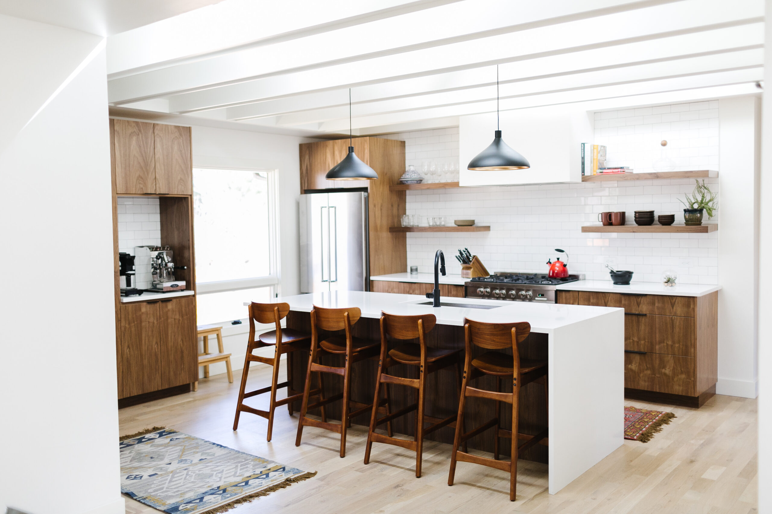
Kitchen and Bath
In the kitchen, Cloud Dancer translates naturally to cabinet color — especially in shaker or shaker-adjacent styles where the tone sits quietly in the room and lets hardware and countertop materials do the talking. A warm white cabinet with unlacquered brass pulls and a quartzite or marble-look countertop is a combination that will age well. In the bath, consider the color as a vanity finish, a tile glaze, or a wall treatment. A Cloud Dancer vanity against warm stone tile and a black-framed mirror has a calm, spa-like quality that does not feel dated the way brighter whites sometimes can.
If you are thinking about a full kitchen remodel or a bathroom renovation, Cloud Dancer is a palette anchor worth building around from the beginning of the design process — not something added at the finish-selection stage.
Exterior Trim
Cloud Dancer works on the outside of your home as well. As a trim color against darker siding — charcoal board-and-batten, deep navy, or a warm cedar tone — it offers more warmth than a pure bright white while still providing strong contrast. On a lighter exterior, it can serve as a full-facade color, particularly for craftsman or farmhouse styles where a slightly creamy white reads as more authentic than a cool, stark white.
Colors That Pair Well with Cloud Dancer
Cloud Dancer is a background color, which means it earns its keep through what surrounds it. Here is how a designer’s palette might be built around this shade.
Warm neutrals. Greige, oat, linen, and warm taupe sit comfortably next to Cloud Dancer without creating conflict. These tones add presence in upholstery, rugs, and case goods while keeping the overall palette in the soft, serene range the color calls for.
Oak and walnut wood tones. Natural wood is Cloud Dancer’s best ally. The organic variation in grain and the warmth of medium-toned wood — white oak flooring, a walnut dining table, open shelving in a natural finish — prevents the palette from feeling flat or sterile.
Blackened steel and aged iron. For contrast and definition, dark metal finishes add an architectural quality that white cannot provide on its own. Black window frames, steel stair railings, and iron hardware give Cloud Dancer rooms their structure.
Soft greens. Sage, eucalyptus, and muted olive pair naturally with Cloud Dancer, evoking something organic and garden-like. These work well as a secondary wall color, in upholstery, or in drapery that you want to feel botanical without being loud.
Dusty terracottas. If you loved the warmth of the 2023 through 2025 palette and are not ready to let it go entirely, dusty terracotta and warm rust tones serve as a connecting thread. Used in throw pillows, a single accent chair, or a piece of pottery, they bring the richness of those years into a Cloud Dancer room without overwhelming the new direction.
Cloud Dancer for Whole-Home Design vs. Accent Use
Using Cloud Dancer as a whole-home color — painting ceilings, walls, and trim in the same shade throughout — works beautifully in certain conditions and less well in others. The factor that matters most is natural light.
In homes with abundant south- or west-facing windows and generous daylighting, an all-Cloud Dancer interior reads exactly as intended: serene, open, and unified. The color shifts pleasantly across the day as the light changes, and rooms feel connected rather than repetitive.
In homes with less natural light — north-facing rooms, heavily shaded lots, or lower ceilings — a flat white treatment can feel dim rather than serene. In those spaces, you are better served using Cloud Dancer selectively: on trim and millwork, on a single feature wall, or in soft furnishings, while keeping the broader wall color in a slightly richer warm neutral that performs better under lower light.
Sightlines matter too. In an open floor plan, a single consistent white across connected spaces creates flow and calm. In a more compartmentalized floor plan, you have more latitude to vary the palette room by room, using Cloud Dancer as a recurring accent rather than a dominant tone.
Bringing the 2026 Palette Into a Northern Colorado Home
Fort Collins and the broader Front Range have a light quality that is genuinely distinct from the Pacific Northwest or the upper Midwest. At roughly 5,000 feet with over 300 days of sunshine per year, natural light here is intense and directional. That changes how colors perform on your walls.
Cloud Dancer tends to hold up well in Colorado light conditions because the softness built into the color prevents it from bleaching out the way a cooler, starker white can. That said, the specific orientation of your rooms matters — and so does how the color interacts with your flooring, cabinetry, and the surrounding landscape visible through your windows. The high-desert sage and sandstone tones of the Front Range exterior environment pair naturally with the Cloud Dancer palette.
At Forge and Bow, our design-build process integrates interior design decisions with architecture and construction from the beginning — which means color and material choices are evaluated in context, against your actual light conditions and floor plan, not as an afterthought. Whether you are starting a new build, planning a whole-home renovation, or working through a focused room refresh, that integration makes a meaningful difference in how the final result performs.
Ready to Explore What Cloud Dancer Could Do for Your Home?
Pantone’s 2026 Color of the Year is a rare design signal: a call toward clarity, calm, and intentional simplicity. If that direction resonates with how you want your home to feel, we would love to help you figure out what it looks like in practice — in your rooms, with your light, and within a design that is built to last well beyond any single year’s trend cycle.
Reach out to the Forge and Bow team at 970-797-2354 or visit our contact page to start the conversation.